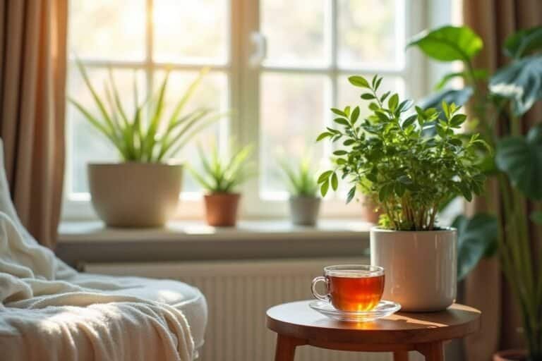
2025 Home Decor Colors: Pastel Trends & Essential Combinations to Transform Your Home with Style
Why Interior Design Pastel Colors Are Revolutionizing Modern Decor in 2025
In 2025, the home decor landscape has taken a fascinating turn. Interior design pastel colors aren’t just a secondary or merely “childish” option; they’ve catapulted into the spotlight, becoming a bold and sophisticated design statement. They are shades that whisper elegance: soft, yes, but with clear intent; delicate, yet with an undeniable power to transform a space without needing to shout.
This revolution is no secret. We see it everywhere: from the most inspiring Pinterest boards and most followed Instagram feeds, to the homes of elite interior designers. From the timeless blush pink interior design to the contemporary sage green decor, decor color trends are dominated by these soft palettes. But why this explosion?
- Bring Light and Spaciousness: Their clear and airy nature makes any room feel larger and brighter, an invaluable asset in modern spaces.
- Ease of Combination: They effortlessly integrate with a wide range of neutrals, woods, and textures, offering a versatile base for any style.
- Sense of Calm and Well-being: They transmit an atmosphere of serenity and relaxation, ideal for creating personal retreats in a busy world.
- Versatility of Style: They work equally well in minimalist and Scandinavian interiors as in more bohemian, vintage, or classic revamped settings. This adaptability is what makes them trending colors for home decor.
If you’re looking for the current color trends in home decor, pastels are the answer. Not only are they fashionable, but they offer an intelligent and emotional design approach for your home.
My Vision on Pastel Tones: What I Admire (Though I Haven’t Fully Embraced It Yet)
I’ll be honest with you. For a long time, my ideal vision of a home has been a sober space, with classic, neutral colors and impeccable lines. I’ve imagined living in a minimalist house, where every object has meaning, a purpose, and harmony resides in simplicity. That’s why my relationship with pastel colors has been, let’s say, one of distant admiration.
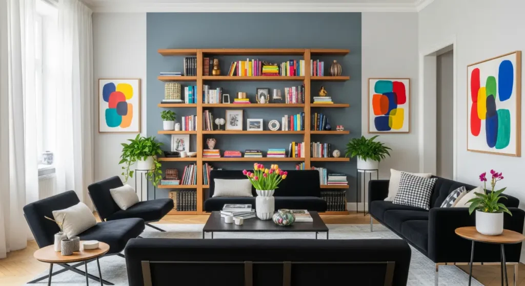
I’d see them and think: “They’re pretty, yes, but perhaps too ‘sweet’ for my style.” They seemed like an accessory, not the main player.
But I’ve learned that pastel tones are far from soft or merely decorative. They are, in reality, a silent shout of personality and sophistication. Using them well requires courage, a subtle understanding of color, and, yes, sometimes a touch of “madness” to break with convention.
That aesthetic confidence they transmit, that originality without loudness, and that ability to create such enveloping atmospheres… I deeply admire their power to evoke emotion, elevate any space, and give it a fresh, modern identity.
If I, a minimalist soul, can see their magic, imagine what they can do for your home!
The Latest Color Trends for Home Interiors in 2025 (and How to Use Them at Home for Real Impact)
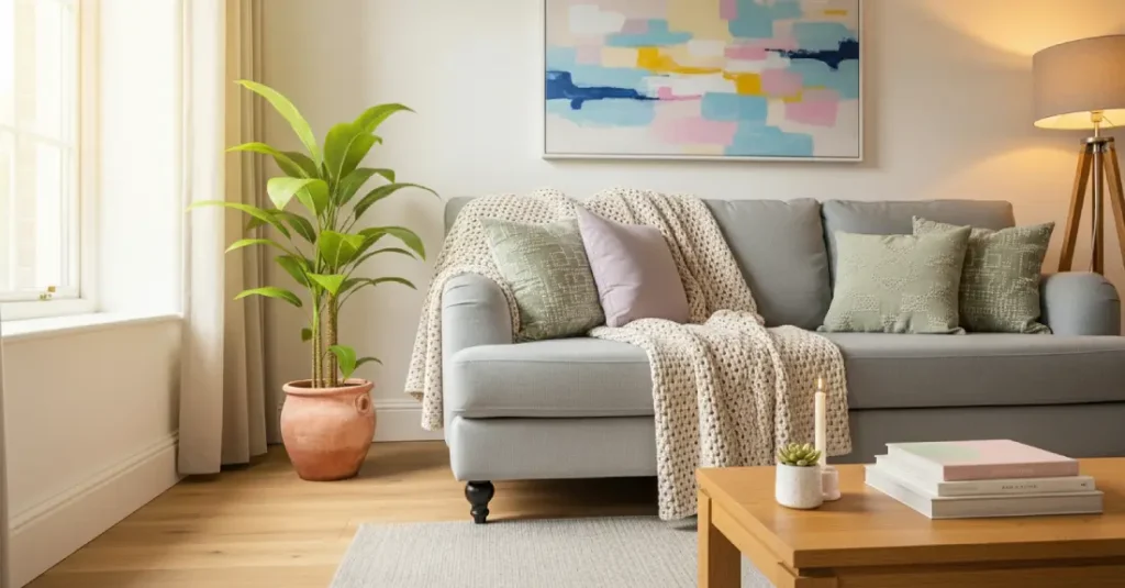
Get ready to meet the chromatic protagonists of the year. Here’s a selection of 2025’s most powerful pastel tones and how you can masterfully incorporate them into your home to follow the decor color trends.
- Blush Pink (Dusty Rose): Subtle Elegance
- Sage Green (Sage Green): Natural Calm
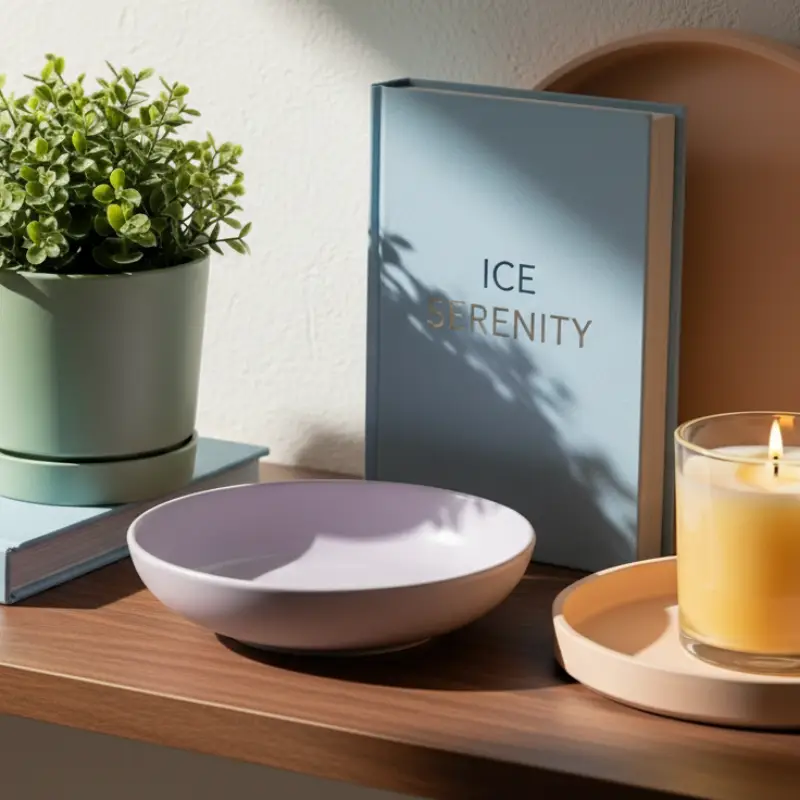
- Ice Blue (Ice Blue): Revitalizing Freshness
- Soft Lavender (Soft Lavender): The Tranquil Embrace
- Light Peach (Light Peach): Enveloping Warmth
- Butter Yellow (Butter Yellow): Serene Joy
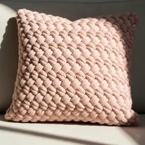
1. Blush Pink (Dusty Rose): Subtle Elegance
- Ideal for: Bedrooms, living rooms, bathrooms, and dining area accents. It brings warmth and a romantic touch without being overly sweet.
- Pair with: Pure white, light gray, light woods, and gold or copper accents for sophistication.
- Bring it to life with:
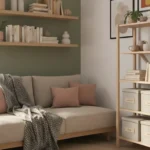
- A blush pink cushion on a neutral sofa .
- An accent wall with blush satin paint – in a bedroom.
- Towels or bath accessories in this shade for a spa-like ambiance.
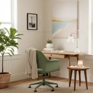
2. Sage Green: Natural Calm
- Ideal for: Kitchens, home offices, bedrooms, and as a main color for furniture. It connects with nature and tranquility. This is a key shade in the sage green decor trend.
- Pair with: Light wood, creamy white, matte black for contrast, and terracotta for a more earthy feel.
- Bring it to life with:
- A sage green chair – in your workspace for a touch of serenity.
- Pastel green curtains that softly filter light.
- Paint on kitchen cabinets or an accent wall in the dining area.
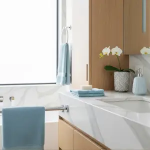
3. Ice Blue: Revitalizing Freshness
- Ideal for: Small rooms, ceilings (to create a sense of height), bathrooms, and children’s bedrooms. It provides luminosity and a feeling of cleanliness.
- Pair with: Pearl gray, warm beige, natural woods, and silver or chrome accents.
- Bring it to life with:
- A main wall with ice blue paint –.
- An upholstered pastel blue bed -for an oasis of calm.
- Tableware or table textiles for a fresh breakfast setting.
- Tableware or table textiles for a fresh breakfast setting.
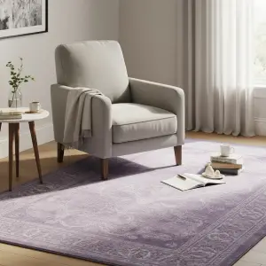
4. Soft Lavender: The Tranquil Embrace
- Ideal for: Bedrooms, hallways, reading nooks, and bathrooms. It induces relaxation and adds a romantic, slightly nostalgic touch.
- Pair with: Old rose, warm white, taupe gray, and soft mint green for a cohesive look.
- Bring it to life with:
- A lavender rug – that defines a reading space.
- Bedding or cushions for a serene bedroom atmosphere.
- Velas or diffusers in this tone for a complete sensory experience.
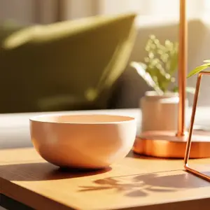
5. Light Peach: Enveloping Warmth
- Ideal for: Living rooms, entryways, accent walls, and cozy corners. It brings a vibrant warmth without being overwhelming.
- Pair with: Olive green, creamy beige, warm gray, and copper accents.
- Bring it to life with:
- A peach ceiling lamp – that bathes the room in soft light.
- Accent walls in transitional areas.
- Decorative vases or bowls for a subtle pop of color.
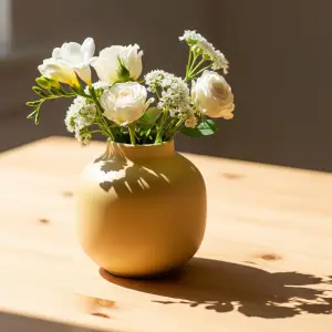
6. Butter Yellow: Serene Joy
- Ideal for: Kitchens, dining rooms, office details, and spaces where a touch of joy is desired. It’s a soft yellow that doesn’t overwhelm.
- Pair with: Pure white, graphite gray for contrast, denim blue, and dark wood.
- Bring it to life with:
- Pastel vases – in this tone for a centerpiece.
- Dining chairs or stools for an unexpected splash of color.
- Kitchen utensils or tableware to start the day with energy.
Searching for stylish solutions?
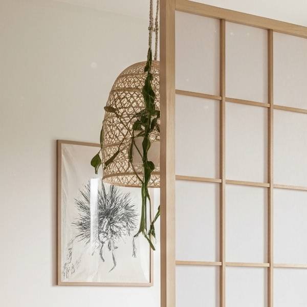
Transform Your Studio With Smart Dividers
Create privacy and style in one small space
Explore stylish room dividers that optimize space and add personality to your studio apartment.
Where to Use Pastel Colors at Home Without Overwhelming Your Space? The Art of Balance
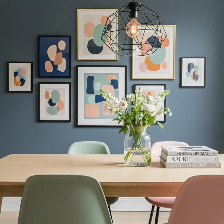
The secret to successful pastel color interior design isn’t to cover everything from top to bottom. The trick lies in moderation and balance. Here are practical ideas to apply trendy pastels harmoniously in different areas of your home:
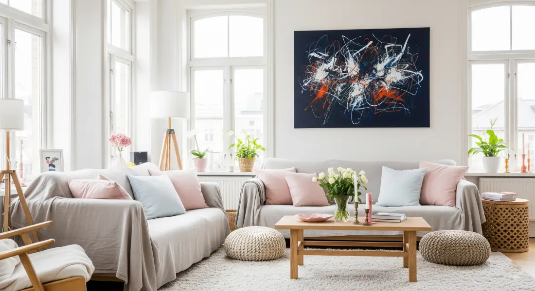
In the Living Room
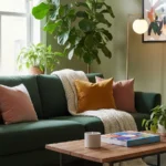
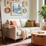
- Add pastel cushions – to a neutral-toned sofa.
- A soft rug in a light pastel shade to unify the space.
- An abstract art piece in pastel tones on a white or gray wall.
- Tip: Consider an accent furniture piece, like a coffee table or an armchair, in a prominent pastel tone.
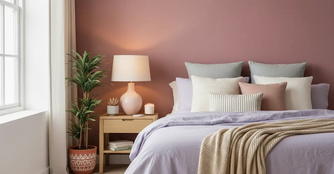
In the Bedroom
- Paint a single accent wall in dusty rose or ice blue for an enveloping touch.
- Invest in lavender bedding – or a soft mint green.
- Invest in lavender bedding – or a soft mint green.
- Incorporate table lamps with pastel bases or light shades.
- Tip: Soft textiles and textures like linen or cotton enhance the calming feel of pastels.
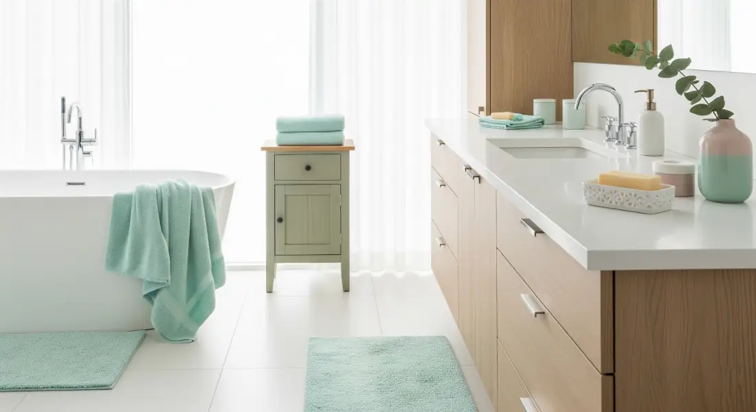
In the Bathroom
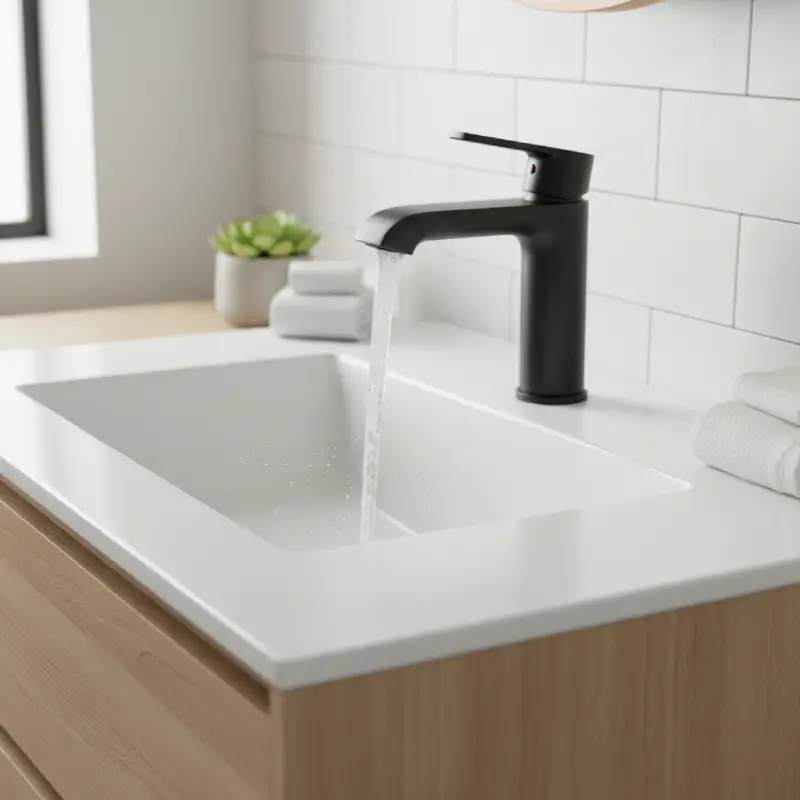
- Update your towels with a soft mint bath set –.
- Decorative accessories like soap dishes, tumblers, or small vases in pastels.
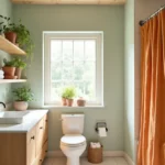
- Consider a small bathroom cabinet painted in a sage tone.
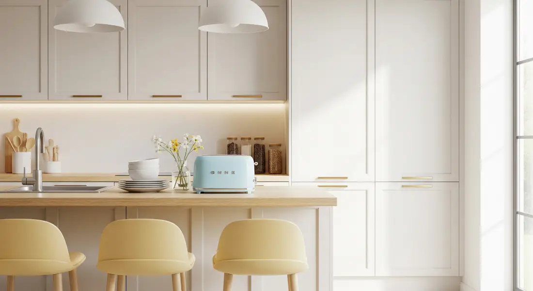
In the Kitchen
- Bar stools or dining chairs in a butter yellow or sky blue.
- Small appliances like toasters – or blenders in pastel tones.
- Tableware or kitchen utensils for a daily pop of color.
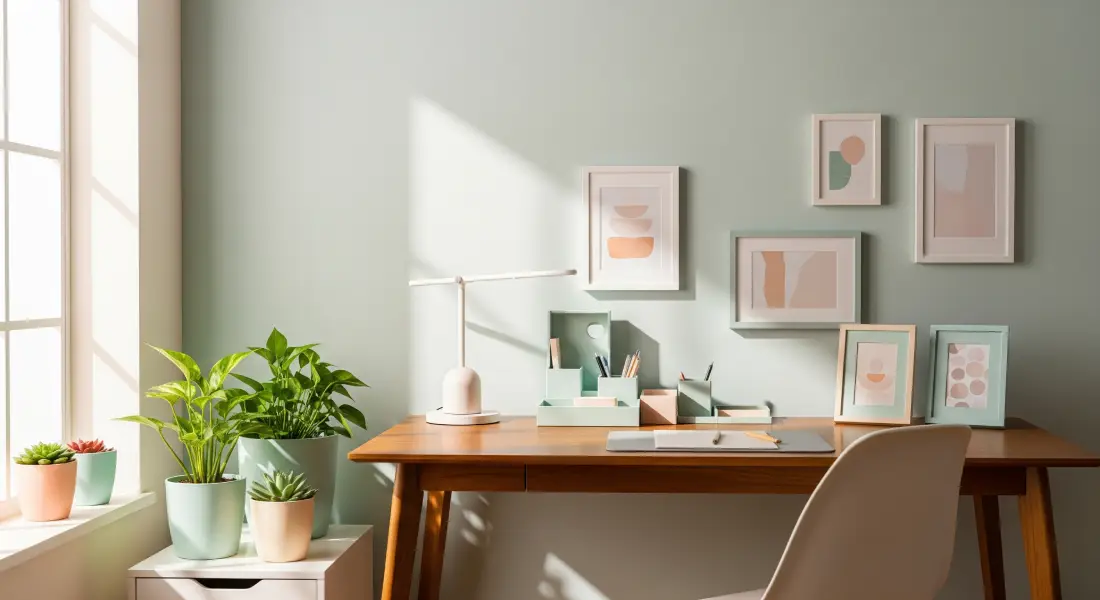
In the Office or Desk
- Desk organizers, table lamps, or picture frames in pastel tones –.
- An accent wall behind the desk for a more creative and relaxed atmosphere.
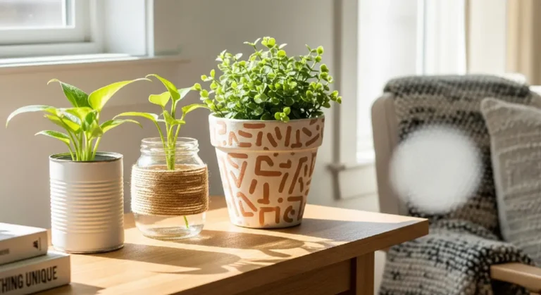
- Plants in pastel pots for a touch of life.
Ready to take your home to the next level?
Budget-Friendly Bathroom Remodels
Affordable upgrades that look luxurious.
Transform your bathroom with simple, low-cost changes that make a big impact.
Combining Pastel with Neutral Tones: The Ultimate Secret to Harmonious Balance
Pastel colors reach their full potential when integrated with a base of neutral tones. These act as a visual anchor, allowing the pastels to shine without overwhelming. The combinations are endless, but here are some winning ones that will help you decorate with how to decorate with pastel colors professionally:
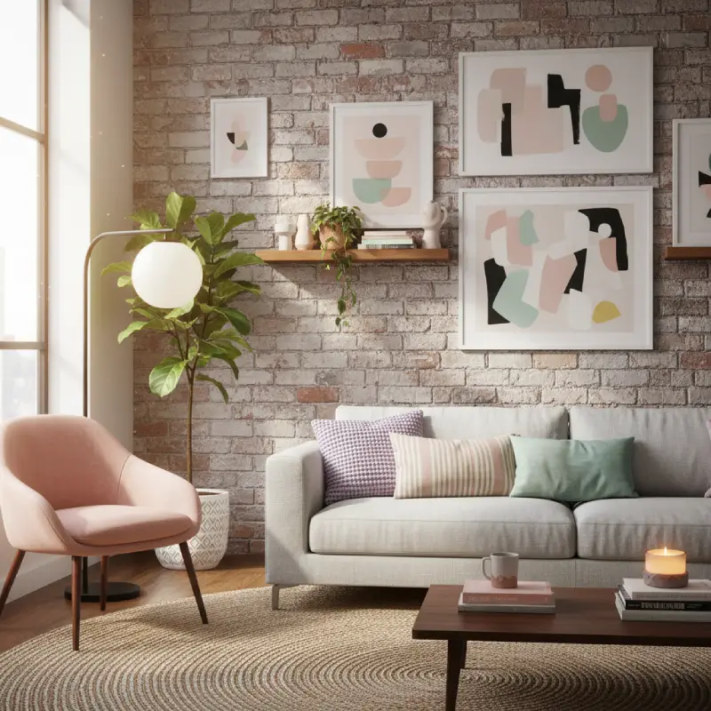
- Dusty Rose + Light Gray: A sophisticated duo that exudes modern elegance.
- Sage Green + Light Wood: Ideal for spaces seeking a connection with nature and warmth.
- Ice Blue + Warm White: A fresh and luminous combination, perfect for small spaces.
- Lavender + Beige Tones: Brings a cozy and serene feeling.
- Butter Yellow + Matte Black: A bold and modern contrast that highlights the luminosity of yellow.
InnerGlowHome Expert Tip: For controlled impact, use pastels on a single plane (a wall, a large piece of furniture, a main textile) and balance the rest of the space with rich textures: linen, cotton, natural woods, metals (gold, copper), and matte surfaces. This adds depth and prevents the space from looking “flat.”
What Mistakes to Avoid in Pastel Color Interior Design (and How Not to Overwhelm Your Home)
Sometimes, a passion for a trend can lead to excess. For your pastel color interior design to be a resounding success and for your home not to feel overwhelmed, avoid these common mistakes:
- Using Too Many Different Pastel Tones in the Same Room: While they are all “pastel,” not all combine harmoniously. Choose a palette of 2-3 dominant tones and use them with intention.
- Painting Walls and Using Furniture of the Same Color: This can make the space feel “washed out” and lose definition. If you paint a wall dusty pink, opt for furniture in neutrals or a very subtle complementary pastel tone.
- Not Including Texture or Contrast: If everything is smooth and pastel, the result can be flat and uninteresting. Introduce textures (wool throws, linen cushions, shaggy rugs, wicker baskets) and some subtle contrast (a dark frame, a shiny metal).
- Not Defining a Palette Before Shopping: Rushing to buy pastel items without a plan can result in a collection of pieces that don’t complement each other.
Tip for Success: Before investing, create an inspiration board (physical or digital, like on Pinterest). Group images of spaces and products you love in your chosen pastel tones. This will help you visualize and maintain consistency.
Conclusion – Pastel Isn’t Soft, It’s Bold: A Silent Shout of Personality
Pastel color interior design might seem shy at first glance, but its impact on a home is profound and transformative. They speak of calm, originality, spaces flooded with light… and a personality that dares to be subtle and brave at the same time. It’s a style that doesn’t shout, but rather whispers elegance and comfort.
Although I myself don’t use this palette yet, I deeply admire it and recognize its power. Because decorating with pastel isn’t just following a trend; it’s a conscious decision to create a sanctuary of tranquility and beauty that reflects you.
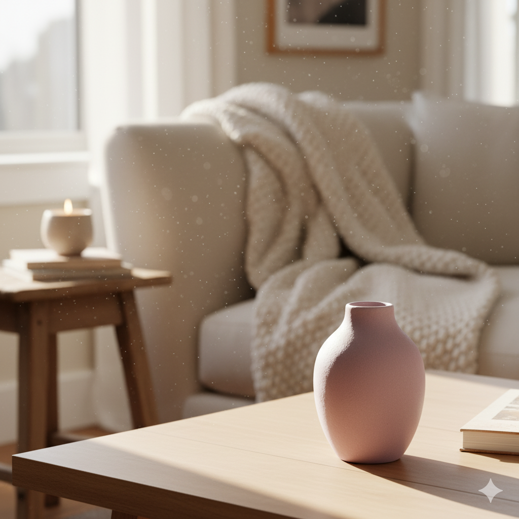
Start today with a single item. A cushion, a vase, a picture. Try an accent wall. See how a single touch of color can change the entire atmosphere. Download our guide to have a clear plan and avoid common mistakes. Or simply add a pastel cushion to your existing sofa and watch how that small change instantly transforms your space.
Because style doesn’t shout. It whispers. And pastel tones are experts at that. Your home deserves that unique voice.
Articles you might enjoy
- Good Quality Cheap Furniture: Your Essential Guide to Styling, Durable, and Regret-Free Furnishing
- Say Goodbye to Clutter: The Best Storage Ideas for Small Apartments and Organized Living
- Smart Furniture for Small Spaces: Your Guide to Space-Saving, Multi-Functional Pieces
- Expert Design for Small Living Rooms: The Best Layout Ideas for Your Functional Home
- Dream Bathroom, Budget Price: Your Guide to Bathroom Remodel Ideas on a Budget (With All Your Soul!)
Table of Contents
Declutter Your Home, Declutter Your Mind: The Ultimate Guide to Getting Started
Overwhelmed by clutter? This ultimate guide blends practical tips, quick methods & emotional insights to help you start decluttering your home and find peace.
Smart Furniture for Small Spaces: Your Guide to Space-Saving, Multi-Functional Pieces
Struggling with space? This guide helps you find smart furniture for small spaces, from versatile bookcases to multi-functional sofas, to transform your home.
DIY Plant Pots from Recycled Materials: Create Unique, Eco-Friendly, and Stylish Planters!
Transform ordinary objects into unique, soulful planters. Discover how to give a second life to recycled materials with this DIY tutorial and turn your home into a more sustainable and stylish space. You don’t need to be an expert, just the desire to create something beautiful.

